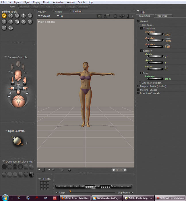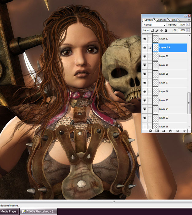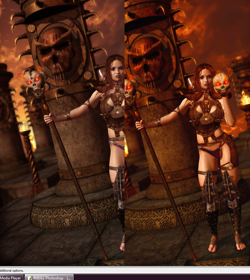
Here I'm gonna do a bit of walkthru of how I go about making an image. This is just my way of doing things and I'm sure there are a million other ways to get more or less the same result so don't take this as "This is how you do it, every other way suck" or anything :) Well like all other poser users I usually start by loading the figure of my choice, in this case V4.
Then I continue with adding morphs, clothes, pose, props and lighting etc. this is mainly a trial and error thing.. For instance in this particular case it would probably have been easier to do 2 different renders in poser.. one of the foreground and one of the background.. easier to get the illusion of depth of field if you can just blur the background and then leave it be.. but I was impatient and did a work-around in photoshop instead.. we'll get to that in a minute
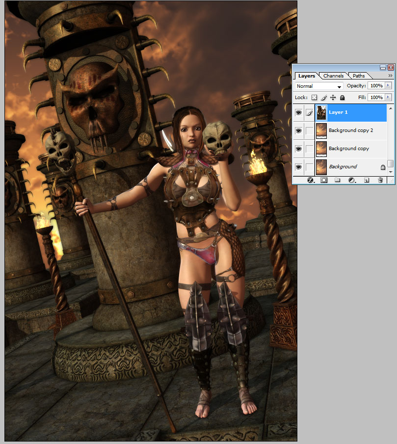
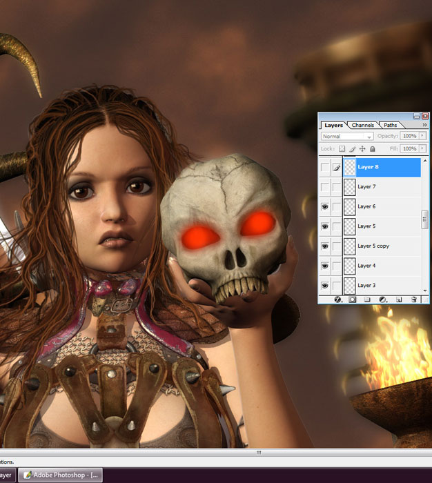
Allright.. lets head into photoshop So we open our background sky of choice and just drag the poser render ontop of it and position it where it seems to "fit"
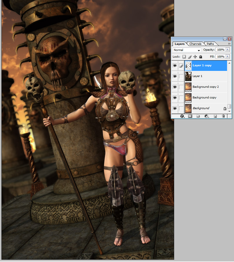
Now we get to the depth of field part.. since Jen is very impatient we need to do the DOF here in photoshop from just a single render.. so we duplicate the layer and blur the top copy.. quite alot of blur..
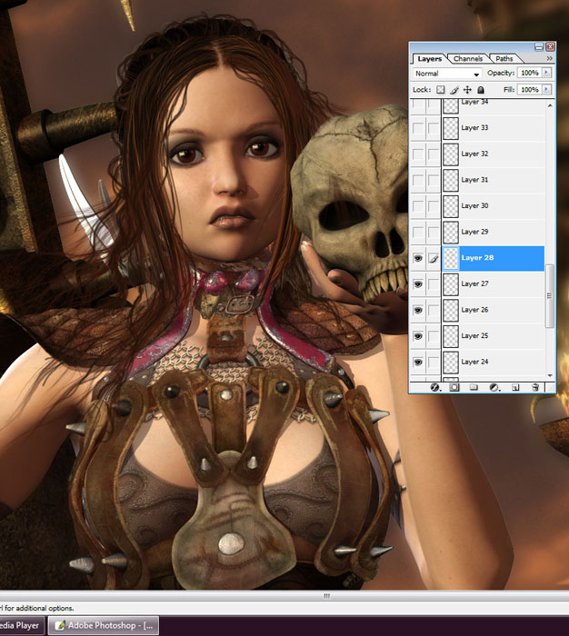
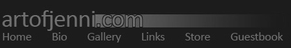
After that we start on the hair, using a base hair is nice cause then you only really have to add a bit to it and not paint the entire thing.. so here I add some strands and make it less straight..
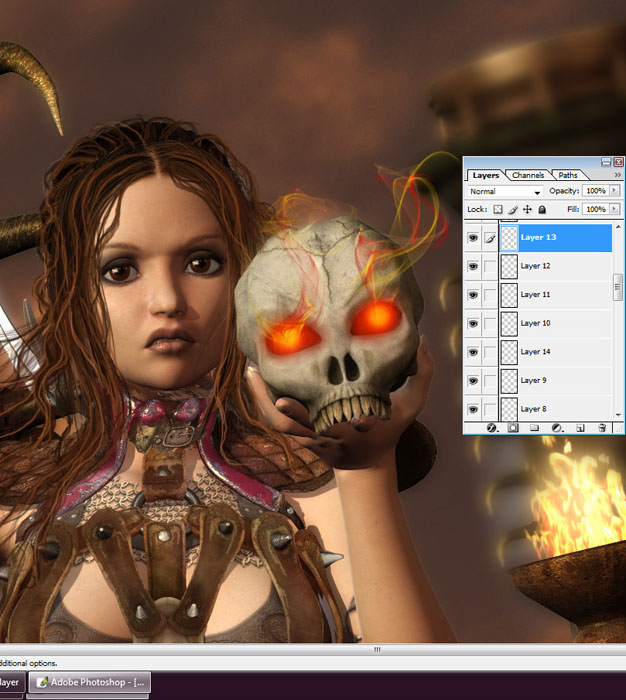
Now I wanna add some flamy smoky feel to the skulls.. so here's how I do that
and here aswell I start with a dark red, then do some orange and finish off with some yellow..
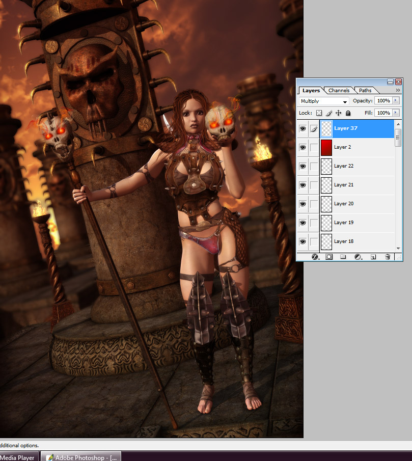
This image I want to call Hellgate, so I want it to be quite red and saturated so I add a layer on top with a gradient colour tint and set it to soft light.. I usually start with the pre-made orange-purple one and then change the colour on that via the hue/saturation slider til I find what I want and after that I make a new layer again and set it to multiply and grab a big brush, usually a 300 soft one.. and paint a little around the edges of the image.. then hit gaussian blur and adjust the opacity of the layer till I think it looks good.. and that's about it.. after that I flatten.. make some final colour adjustments and save a big version of the image first.. then re-size to a proper posting size in galleries ( which I think should be so you can see the whole image on screen at the same time.. which makes a "standard" size hard to say, since ppl have different size monitors and resolutions.. but if you have to scroll you won't see the entire composition at once and it usually takes away more than it adds, then it's better to post a detail shot separately if there are really fine details you wanna show off :)
Hope that helped to get a better idea of how I usually work with my images.. feel free to contact me if you have any questions about something I mentioned here or something I didn't mention here for that matter aswell ;) -Jen
|